PeerWorks

Rebrand

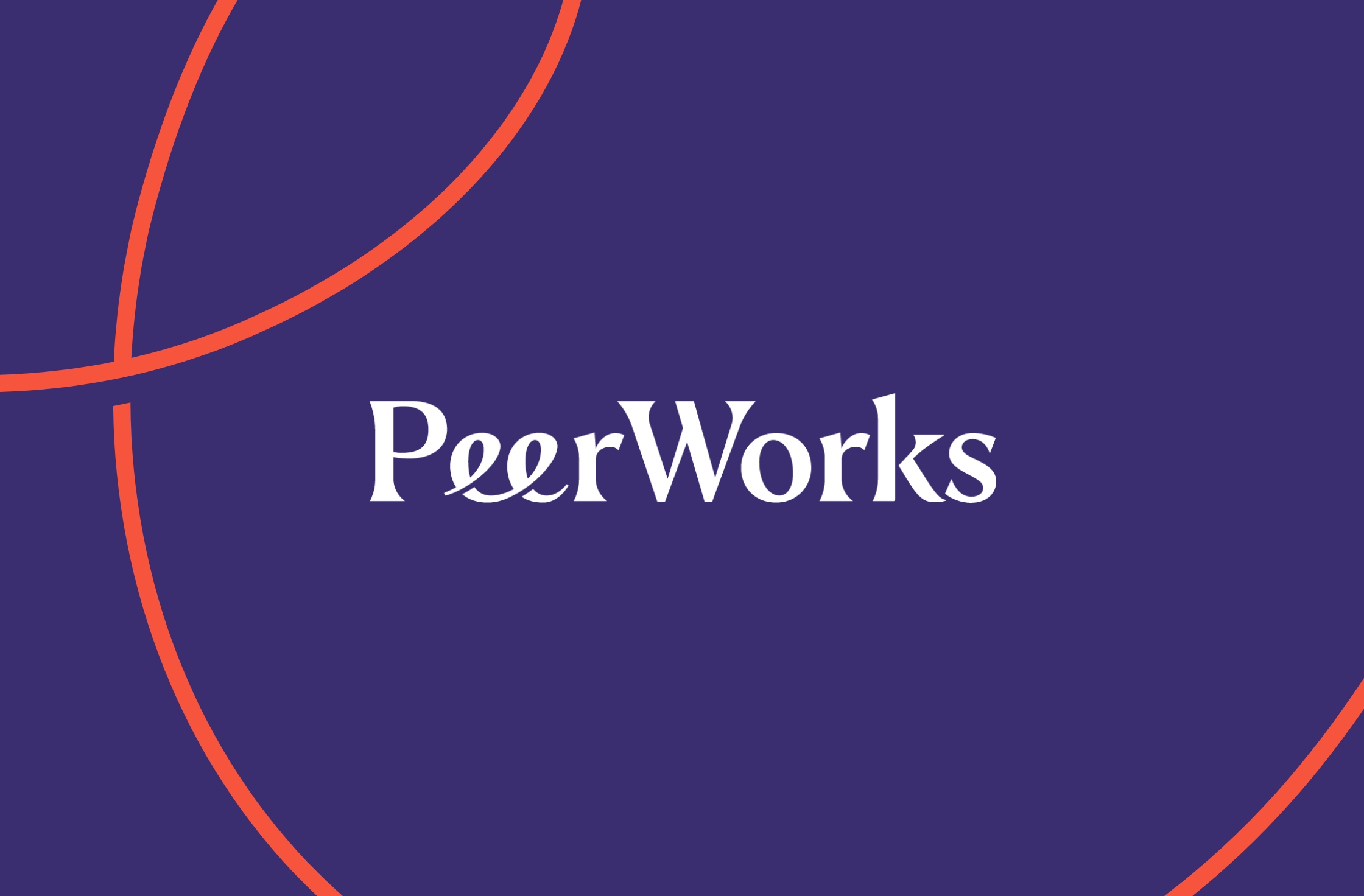
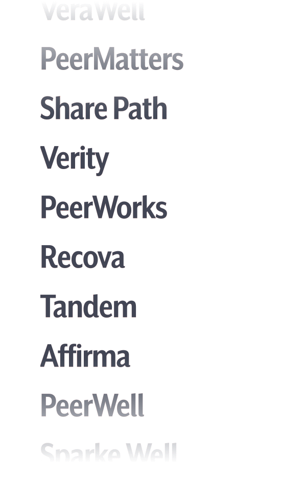
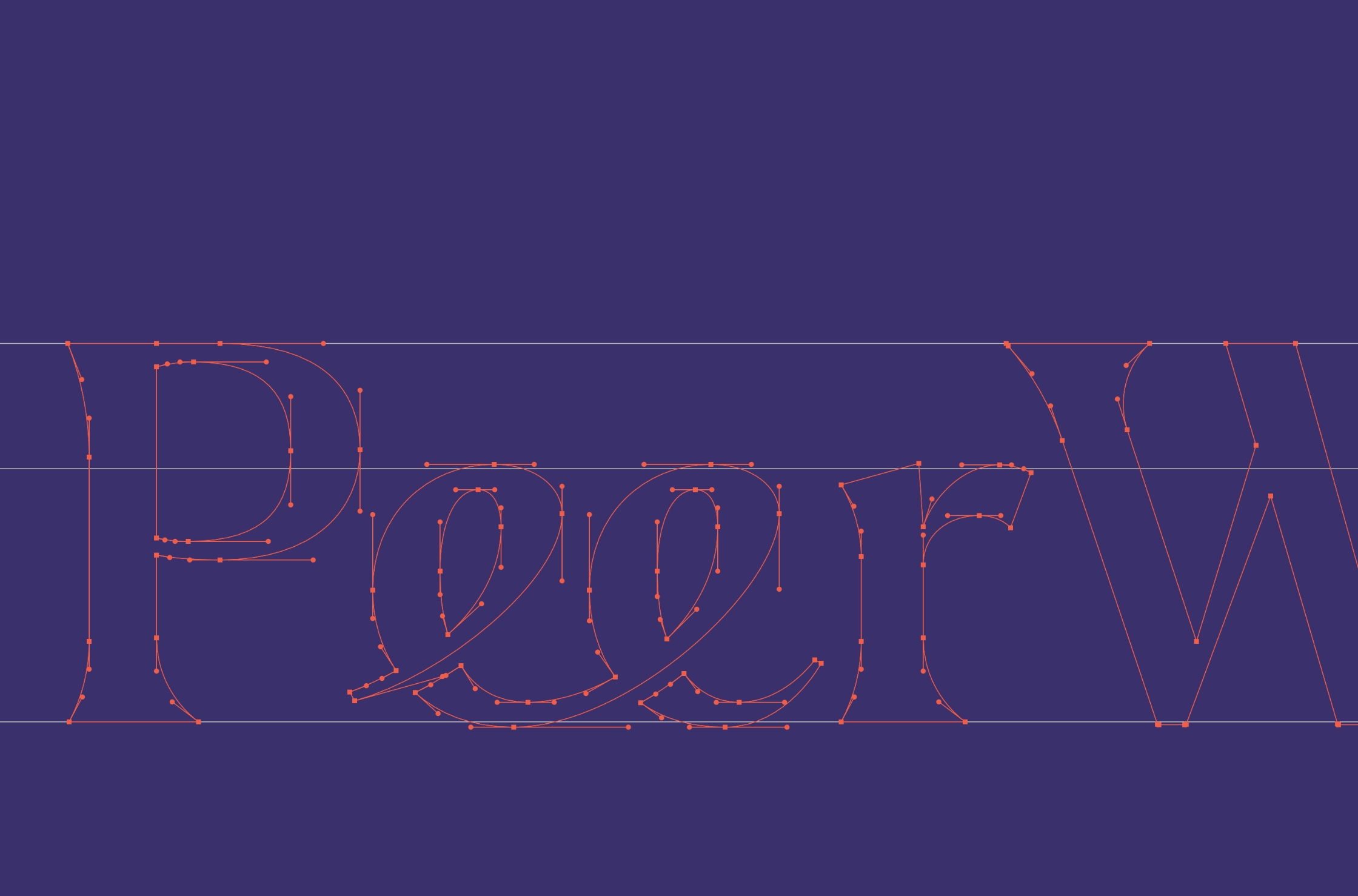
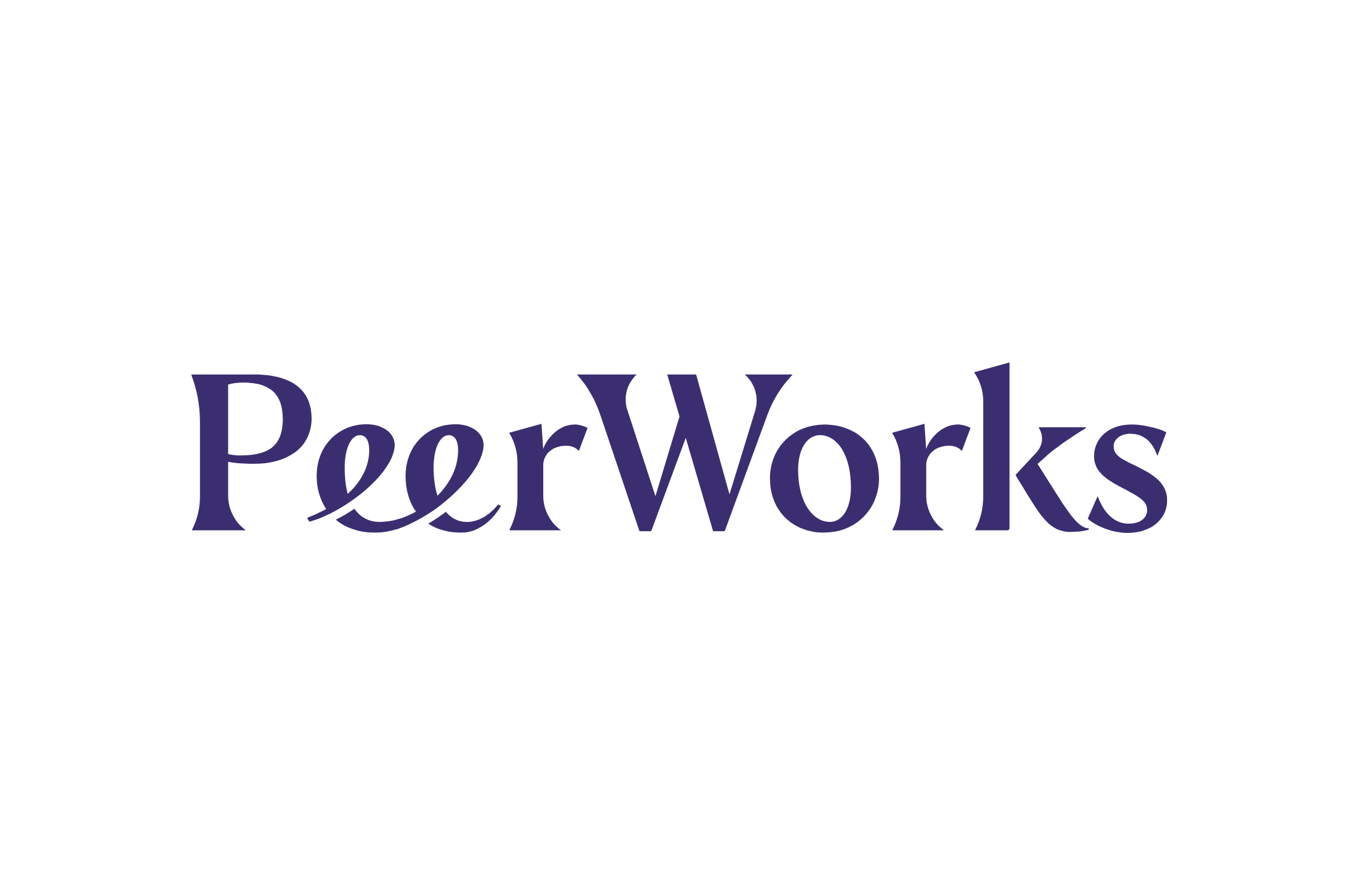
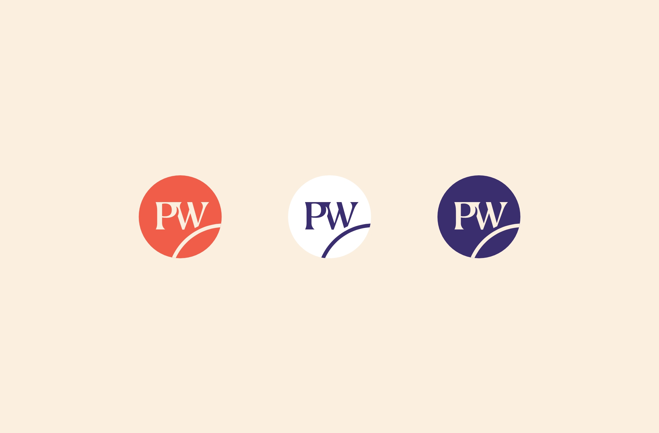
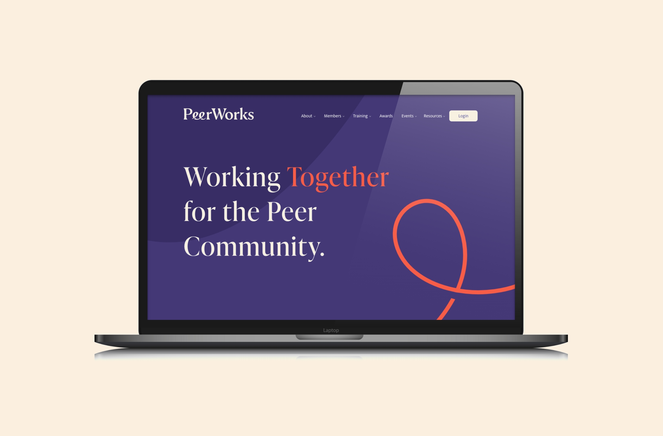
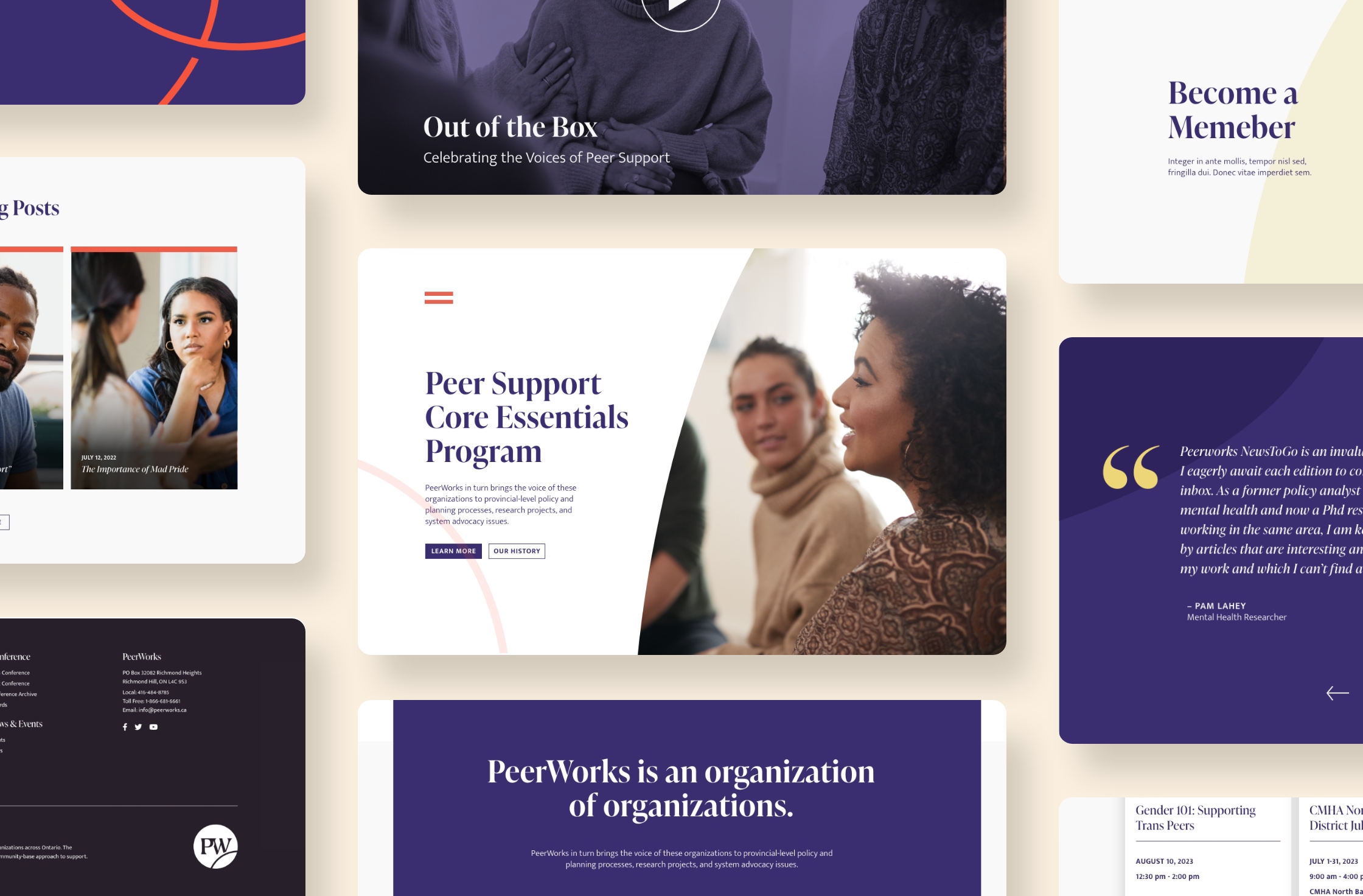
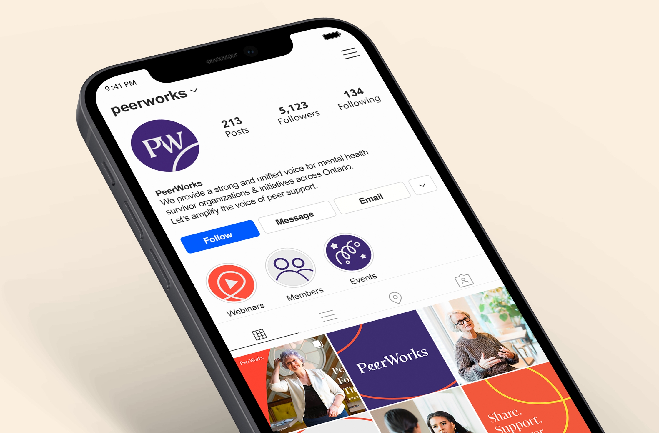
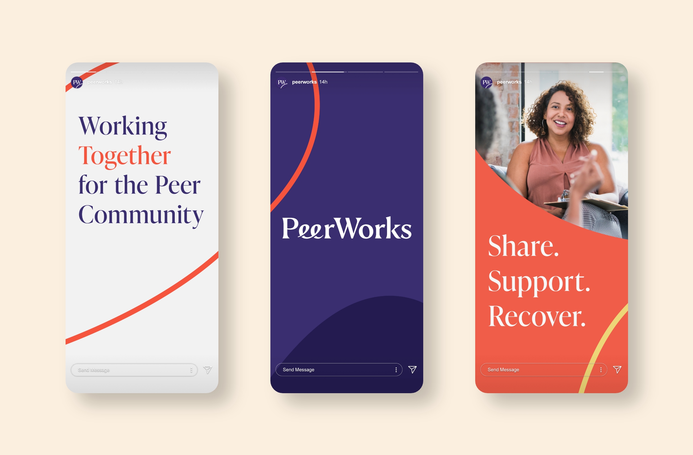
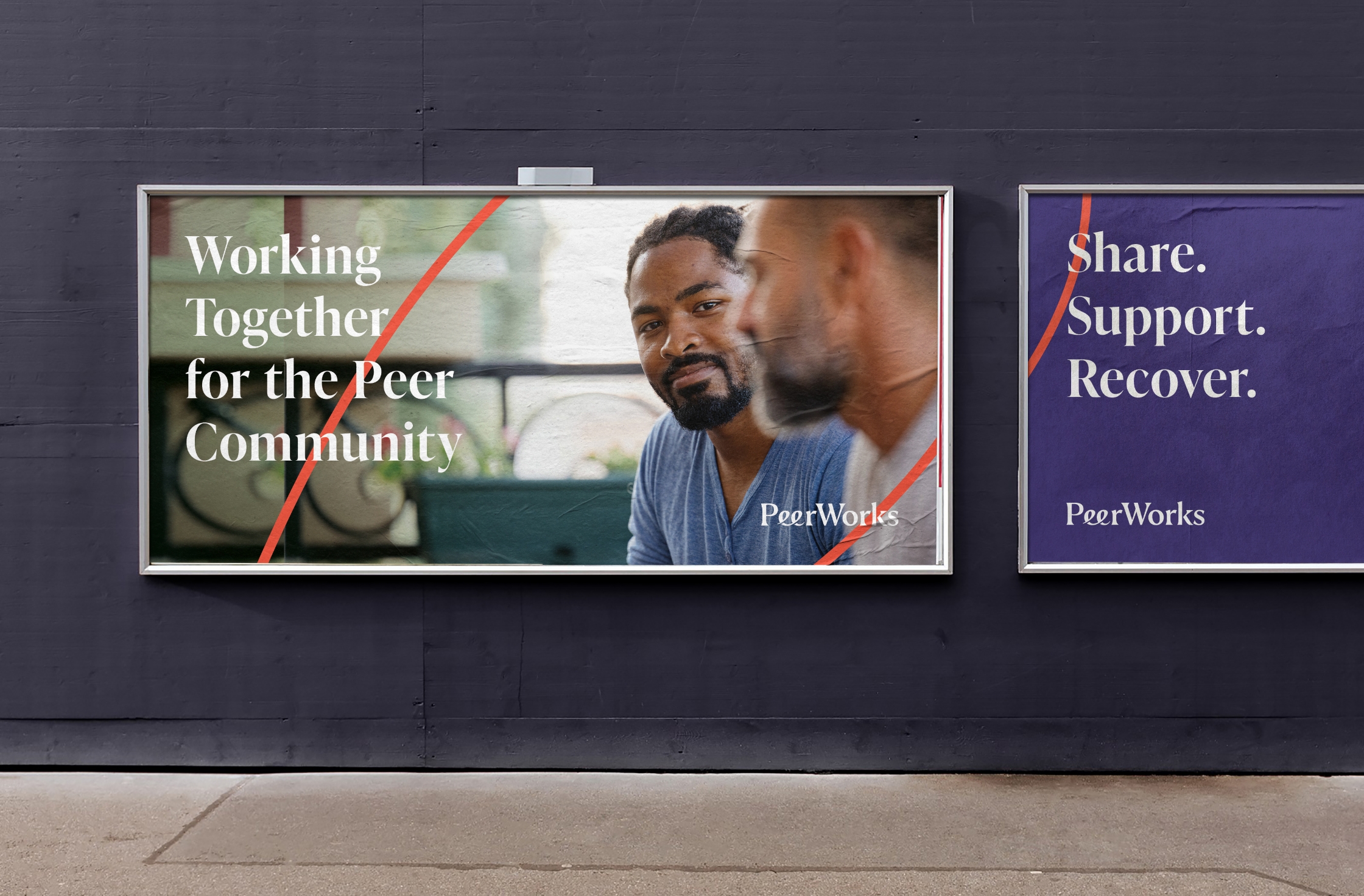
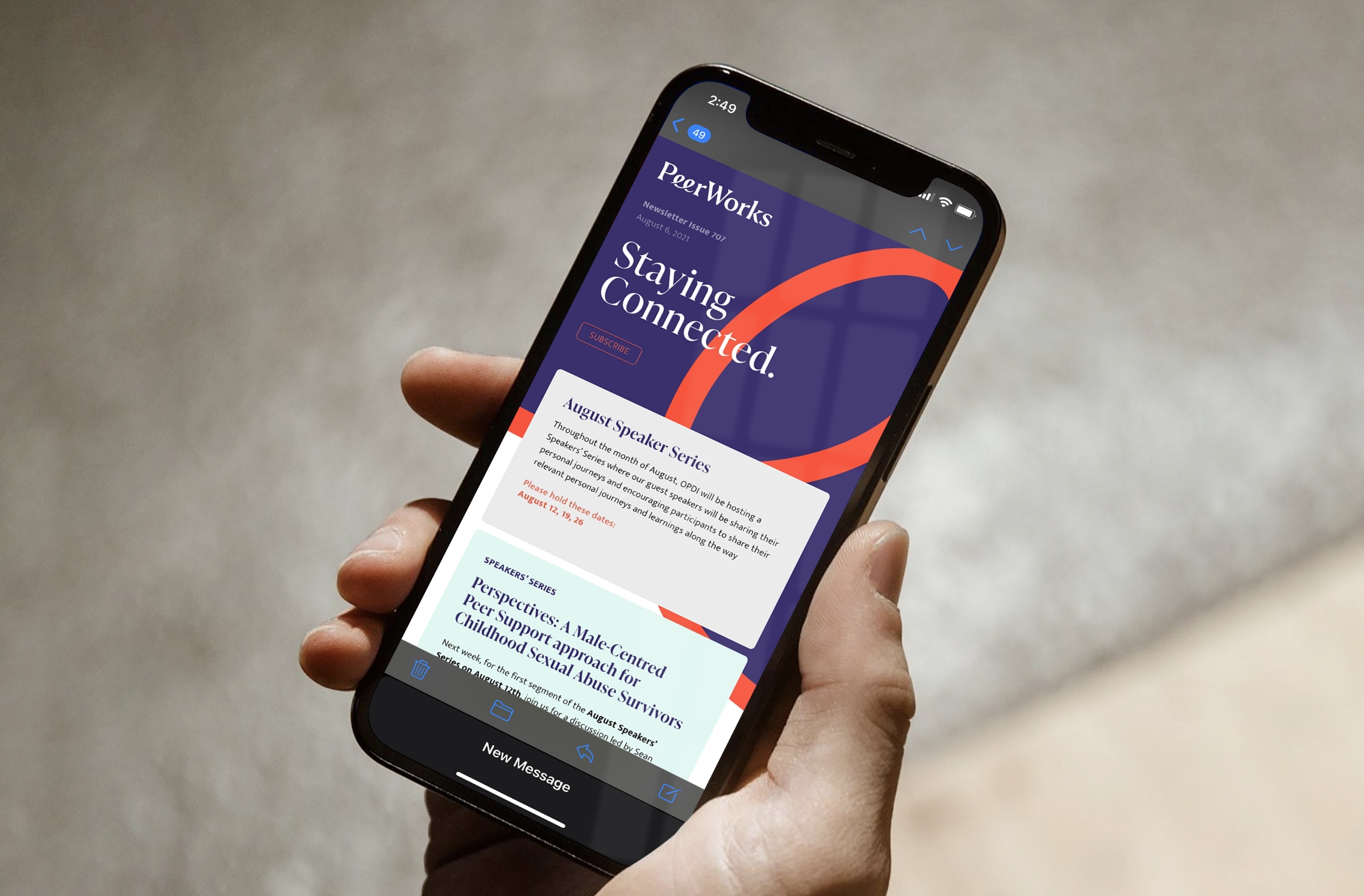
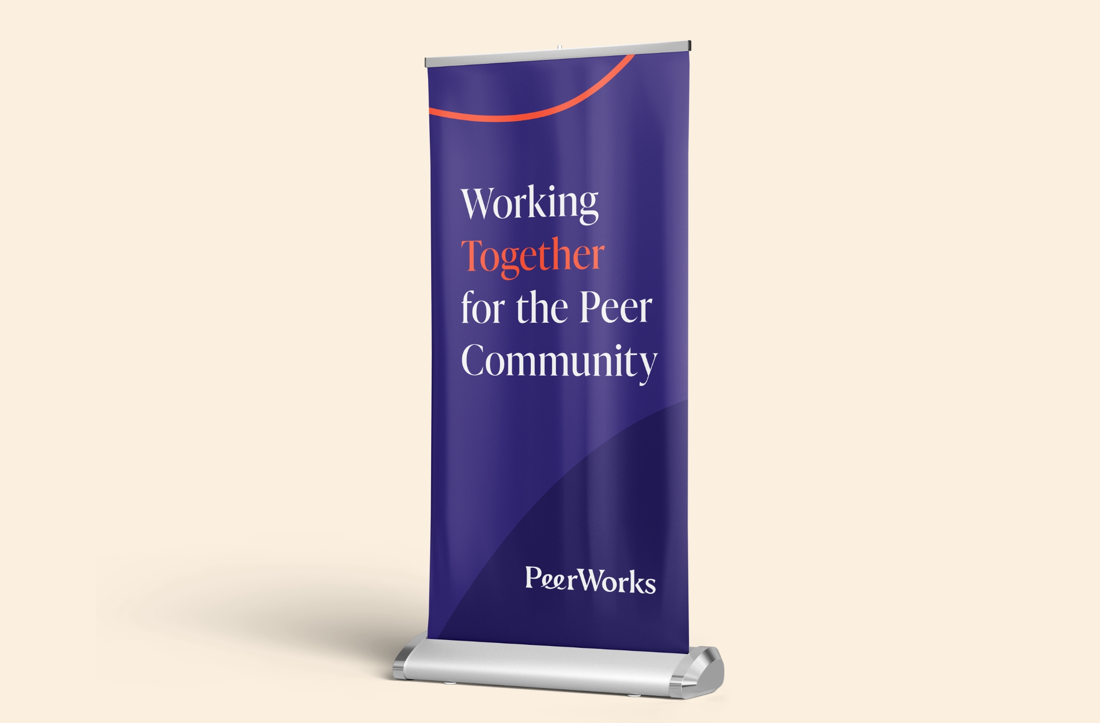
PeerWorks is an organization that provides Advocacy, Education and Research in the field of Peer Support. Peers are people with “Lived Experience” providing  formalized support to others who are going through similar journeys. They tasked us to direct a rebrand that focused on, developing a new name for their organization, increasing brand awareness and making the brand more modern and innovative.

What is a “Peer”?

Peers are people with “Lived Experience” providing formalized support to others who are going through similar journeys. They can be supplementary support to formal Health Care & Wellness System.

Naming

PeerWorks started life as the Ontario Peer Development Initiative (OPDI). When approaching the rebrand, the first thing we addressed was the name! We developed over 500 names and finally settled on PeerWorks, a name that was easy to remember and descriptive!

Wordmark

The idea behind the brand is making connections. The Wordmark builds on that concept through the relationship between the linked “ee’s”, creating a sense of connection when contrasted with rest of the mark.

Colour System

Based on our research there was a large gap in similar organizations using Purple as a brand colour. We think it works well as a distinct brand colour. It also connotes warmth and confidence in equal measure, a perfect combination for this brand.